Hasin is a globally-minded multidisciplinary creative technologist & educator based in New York City 🗽.
Drop me a line at hello@hasinahmed.org
Reviews • Services • Packages
Book Exploration Call
Work
Collection of my diverse set of professional & academic work.
Discover fake news platforms with the aid of artificial intelligence & machine learning.
End-to-End Designer
I worked with the CTO and team to research, define requirements and KPIs, and create a front-end prototype.
Identified KPI
Enabling brand managers to identify fake news using Artificial Intelligence and machine learning.
Advanced Prototyping
Created a sophisticated prototype in Axure showcasing essential UI interactions and data models.
Designed 30+ transactional email notifications based on user actions and user preferences.
Research
Interviewed 100+ users early users to understand their notifications preferences.
Design System
Developed email design system in figma and coded reusable blocks in sendgrid.
Quality Assurance
Conducted email render testing to identify and address issues across 1000+ render permutations of os, browser, and and device (mobile/ desktop) combinations.
Saving project managers precious time and on a week over week basis.
Extraneous Process
Previously, organizations had to import data into PowerPoint before emailing it.
Key Problem
The process was cumbersome and led to erroneous and duplicative work.
Solutions
An email based responsive report that can be sent to any email address.
A easy to easy to templating tool to plan every aspect of your project plan.
Reduce Duplication
Ensure all project plans are standardized.
Standardize Operations
Every project manager in your team uses the same process.
Forecast
Preview & project when your project can be potentially delivered.
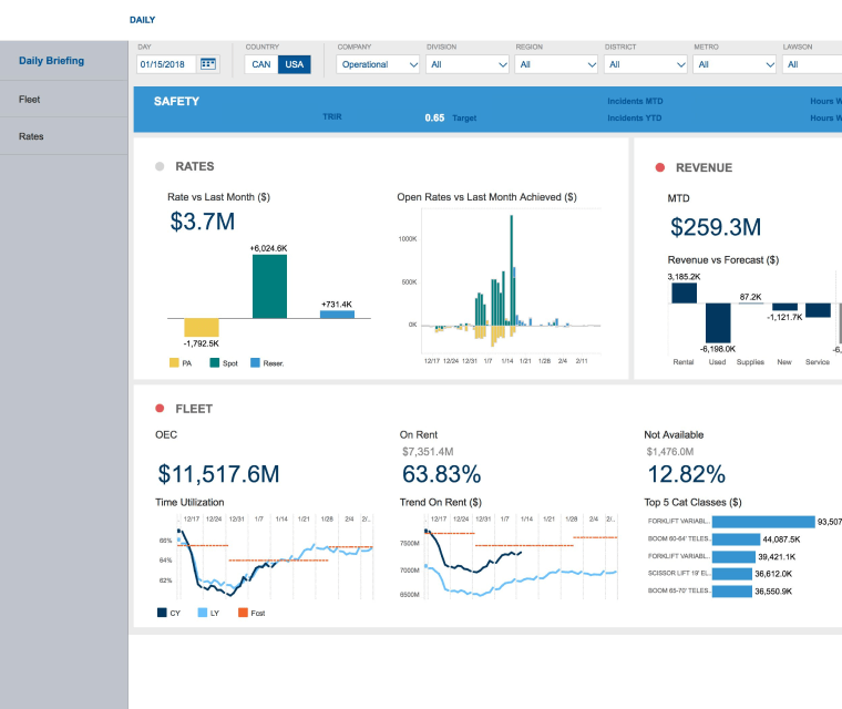
Tracking healthcare association business readiness across 8 domains.
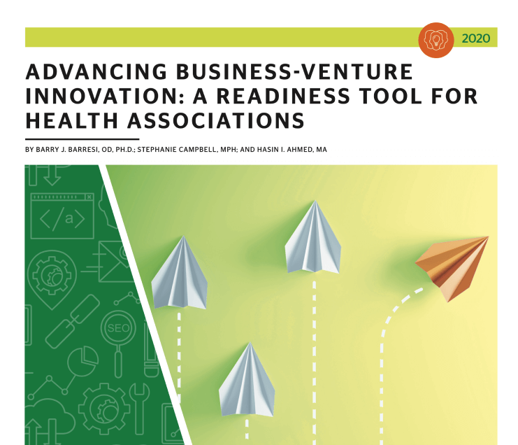
Research Designer
Co-led the design of all research phases, including secondary research, survey design, and conducted contextual interview with C-Suite executives.
Lead Analyst
Conducted descriptive and inferential statistics to establish key research insights.
Data Visualizer
Applied best in class data visualization techniques to ensure effective interpretation of the visualization.
I have taken this business from zero to getting its first customer. I led all aspects of design and managed two junior designers.
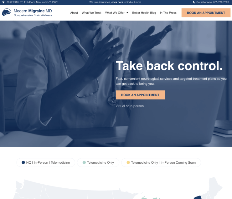
Lead Designer
Redesigned the product twice over the last 2 years, including merger of two brands.
100 Patients Surveyed
Understood patient needs across 11 states and refined product offering accordingly to user feedback.
Frictionless Booking
Implemented a process where users can book appointments without creating an account, leading to 23% increase in first-time patient book rate for Q1 of 2021.
Executives consistently required an analyst’s assistance to access alumni data due to frequently lost Excel sheets and PDF reports.
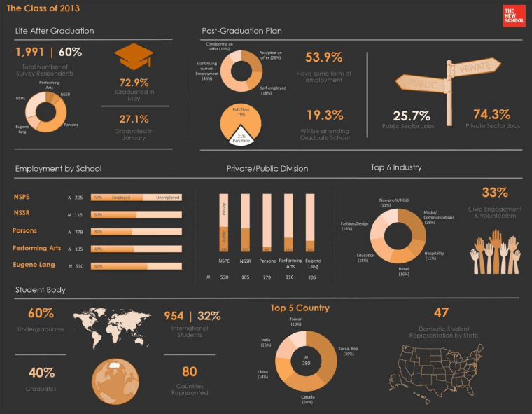
100,000+
Data points explorable in a single dashboard.
Lead Analyst
I was responsible for the design of alumni survey, data analysis, KPI definition.
Visual Designer
This was my very first data-focused professional visual design project.
This portfolio introduces “mr. unemployed,” an interactive, humorous digital avatar that offers a gamified exploration of my professional and personal life.
Overview
In 2016, as I finished grad school, I created a unique portfolio that went beyond showcasing work. It featured “Mr. Unemployed,” an interactive avatar that cleverly indicated I was open for job opportunities.
User Events
A key aspect of the project was tracking user interactions like clicks, hovers, and key presses, enabling engagement with the “Mr. Unemployed” avatar to reveal his character.
Gamification
Each page features a d-pad for a game-like experience, with SVG graphics that scale well on devices from mobiles to 4k monitors.
A millennial focused subscription service for feminine products.
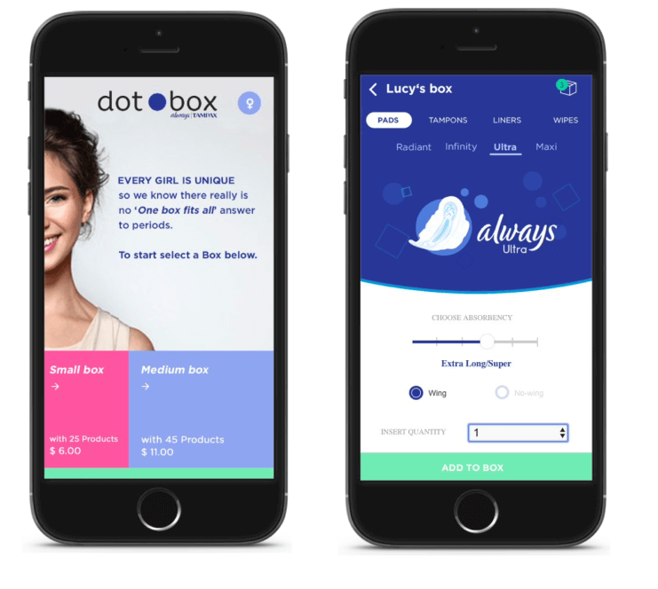
60+ Products Viewable Within a Single UI
Users can easily explore all 60+ different products that fall under feminine care category within the same screen and add products to their checkout cart without exiting the exploration page.
Dynamic Prototype
Develop an axure prototype that simulates a dynamic data driven checkout experience.
Subscription Packages
Users can choose between three different subscription packages and select a specific number of products, which depends on the type of subscription
A showcase of stories, policies, and programs that are fueling Rwanda’s transformation journey.
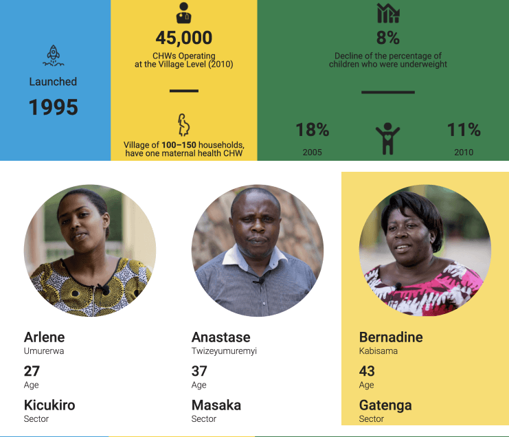
Information Architect
I was responsible for creating a high-level information architecture that served as the foundation for the development of a fully functional prototype, which took around 3 months to complete.
Data Visualizer
Two interactive case study prototypes were designed and developed, which included data visualization, a short documentary, individual testimonials from the benefactors of the social programs.
Architecture
I was responsible for creating a high-level information architecture that served as the foundation for the development of a fully functional prototype, which took around 3 months to complete.
Learn about cities from around the world.
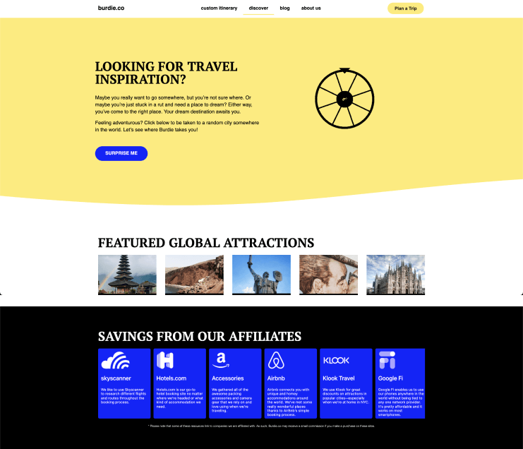
Research
I was responsible for redesigning the user experience based on feedback from 100+ users through social listening, surveys, and contextual interviews.
Lead Designer
The app originally started out as a content project, where we recommended different under the radar destinations to the users. At the moment, the app also allows users to request custom itinerary for a nominal fee.
Motion
Various animations were incorporated in the recent iteration of the design to create a sense of movement through motion. You can see the example of some of the motion graphics here.
Designed a new data collection flow that factored in both the online and the offline visitors at the Kigali Genocide Memorial.
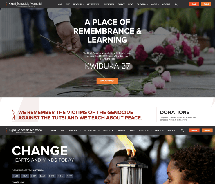
Database Aggregation
Developed data taxonomy and logic to automate email drip campaigns.
Donation Visibility
Developed the strategy for a data-driven newsletter that showcased the amount of money that a donor has donated so far.
15% Increase in Newsletter Open rate
The strategic initiative lead to an increased engagement within the first quarter.
Excel-based sales analysis workflow leading to unpredictable deal flow schedules and miscommunications of price quotes among sales teams.
Contextual Interviews
Conducted executive interviews with VP-level and C-level executives.
Ethnography
Studied sales team behavior through week long immersion within the sales floor.
KPI Definition
I was responsible for the initial scoping of the key metrics.
The cost of Google search advertisements rose by 27% year-over-year from 2021 to 2023, prompting our growth team to reevaluate and update our lead generation strategy.

Content Audit
Determine pertinent content themes and delivery channels by analyzing competitors and leveraging high engagement rates with our customers.
Setting Targets
Establish our objectives by applying the SMART criteria, ensuring they are Specific, Measurable, Achievable, Relevant, and Time-bound.
Establishing Cadence
Set up a regular schedule for publishing content on social media channels and our own website, including blogs, resources, and ebook downloads.
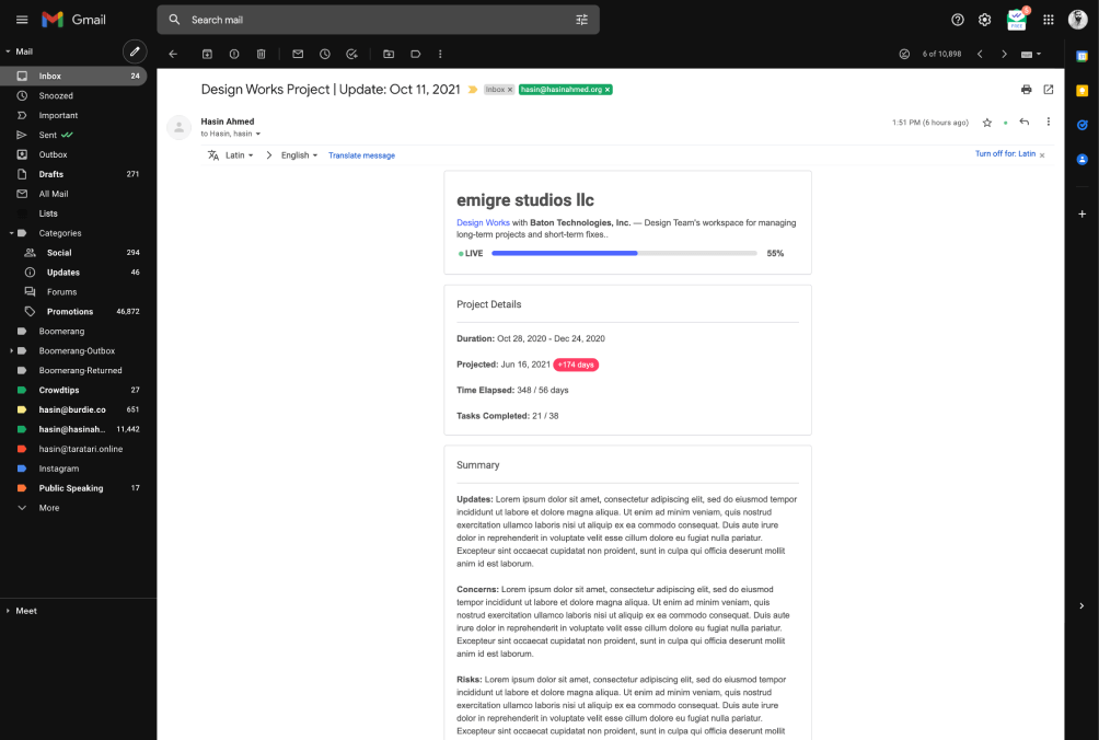
Fostered a tradition of seamless transitions by implementing comprehensive feature requirements handoff documentation, detailing every facet of a feature launch for our design, engineering, customer success, sales, and marketing teams.

The Challenge
The intricate aspects of software development present challenges in conveying subtle details solely through static product imagery.
Problem Discovery
Pinpointed critical communication breakdowns within the organization’s operational procedures by conducting interviews and analyzing our team’s interactions on Slack and email.
The Goal
A single source of truth – Keep a detailed log of our product launches and the enhancements to current features as they occur.
Aiding our internal groups (product, design, engineering) in grasping the effects (or the absence of effects) of our major feature releases.

Methodology
Real-time reporting dashboards, powered by Metabase and Google Sheets, to deepen our analysis for each enterprise client.
Applied Research
Assisting in pinpointing customers with high usage rates during the trial phase of the sales process.
Executive Communication
Automated weekly reports delivered straight to the leadership team’s email or distributed to the entire team through shared Slack channels.
A web-based cartographic application that I designed and developed during my graduate studies.

The Challenge
This initiative was designed to improve the user experience on trademap.org, a key research tool during my graduate studies in economics.
Solution
Developed an interactive cartographic dashboard with Carto’s API and displayed pie and bar charts via Google Charts API.
Methodology
The project’s data was sourced from trademaps.org, and I employed conventional cartography and UX design techniques to transform the data from tables and static charts into an engaging visual interface.
An academic project exploring the extensive guide that unravels the complexities of the New York City subway system. Uncover its historical background, operational details, recent developments, and significant aspects affecting the user experience.

Scale
NYC’s subway is one of the world’s most extensive, with 469 stations and 24 lines, boasting an annual ridership of 1.7 billion in 2015.
History
The project outlines the subway’s historical development and key events shaping its current structure, ranking as the fourth largest globally at 33 miles.
Challenges
Commuters face issues due to the system’s age and design, particularly with unclear signage and cluttered displays, leading to information overload. Proposals include improved signage and multilingual support.
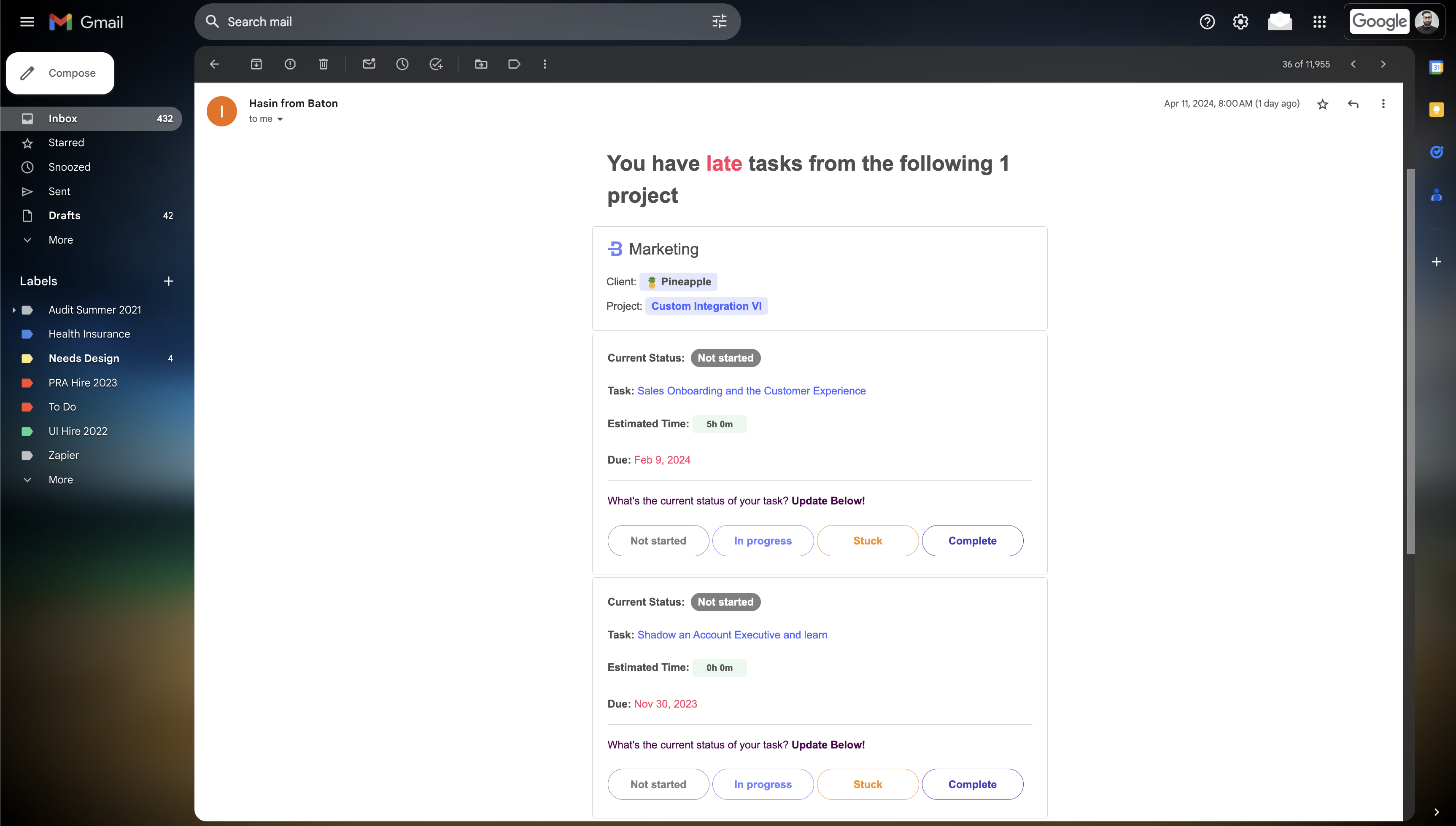
Enhancing Customer Experience and Retention through Effective Onboarding Strategies from pre-sales to post-sales.

Onboarding Strategy
Developed an in-house onboarding system that communicated Baton’s value from sales to post-sales, increasing customer satisfaction, retention, and loyalty.
Knowledge Bases
Audited and updated the Baton Knowledge Base to provide clear, accessible information, enhancing onboarding and increasing trial-to-paid conversion rates.
Role-Based Tools
Implemented product tours and role-based email sequences to meet the needs of different user types, ensuring they leveraged Baton’s features effectively for higher engagement and satisfaction.
Collaborating with marketing, sales, and customer success teams to reach current and prospective customers.

Webinar Formats
Webinars included presentations, panel discussions, interviews, and case studies to explore topics, engage experts, provide insights, and showcase applications.
Webinar Topics
Webinar topics included project planning, onboarding, implementation, integration, collaboration, and revenue generation.
Target Audience
The target audience includes current customers (education and feature adoption), prospective customers (new acquisition), and passive observers (increased engagement).
Streamlining Integration with a Customizable Entry Point and Enhancing Navigation for a Superior User Experience.

Deployment Framework
Simplifying integration with a configurable routing entry point, customizable by the professional services team for each deployment.
Enhanced UX
Improving navigation and engagement across the products portfolio of 200+ SKUs.
Consistent Naming
Establishing uniform component names, component events to improved inter-component communication.
Utilize URL query parameter to design customize landing pages with prefilled form content for email campaigns.

Enhancing Engagement
Utilizing URL query parameters to prefill form content creates a personalized experience for users, increasing the likelihood of engagement and conversion.
Campaign Management
Enable the marketing teams to efficiently generate multiple customized landing pages for different email campaigns.
Data Accuracy
Prefilled forms minimize the risk of user input errors, ensuring more accurate data collection and improving the overall quality of lead information.
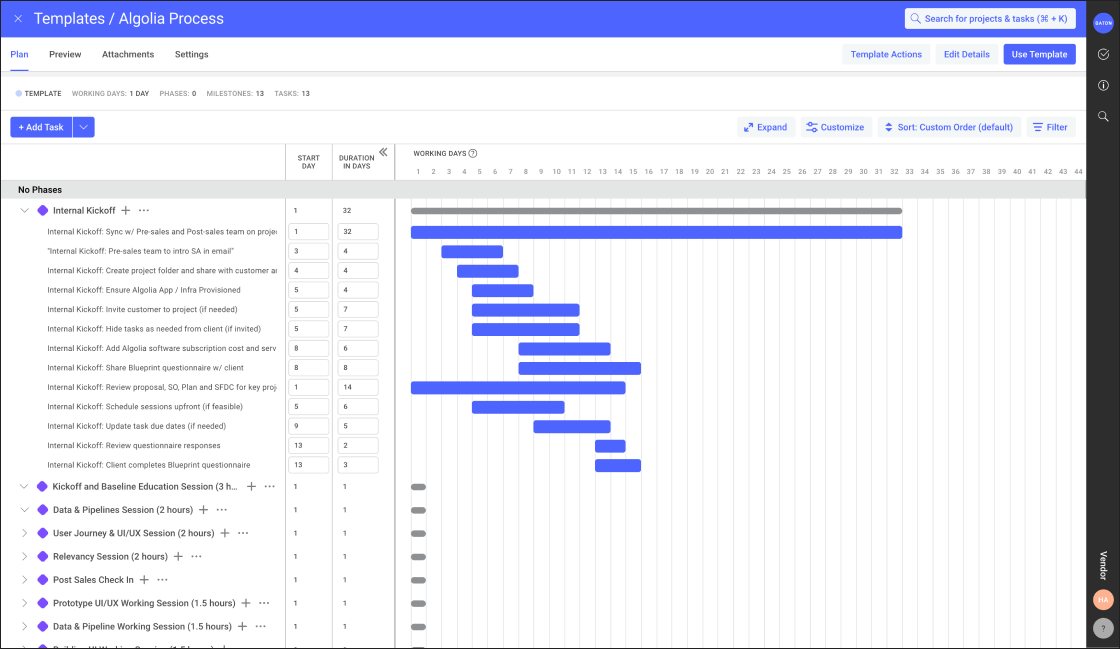
Synchronizing project data between Salesforce and Baton to eliminate manual reconciliation and strengthen sales‑to‑implementation alignment.
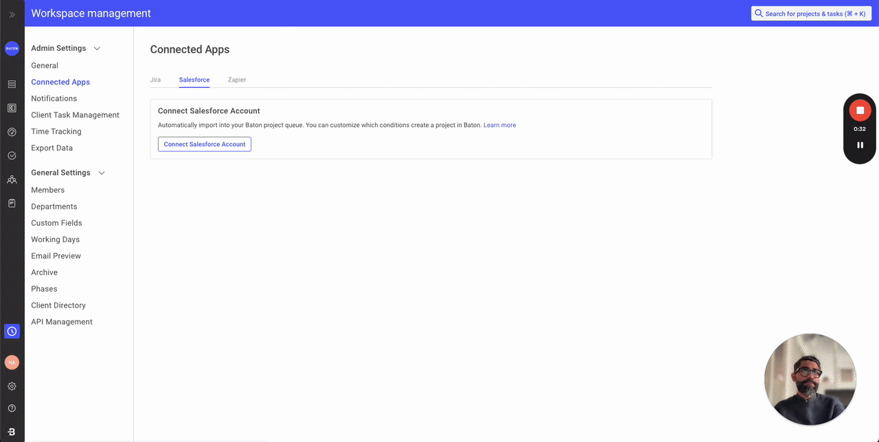
Field Mapping Framework
Enabling vendor admins to configure one‑way field mappings between Salesforce objects and Baton project fields for seamless data synchronization.
Enterprise Workflow Alignment
Supporting sales, implementation, and executive teams by ensuring project status, risk, budget, and milestone data remain accurate across both systems.
Customer Impact
Reducing manual data entry, improving reporting accuracy, and removing a key adoption barrier for enterprise customers such as Algolia, Tenfold, Fairmarkit, and VTS.
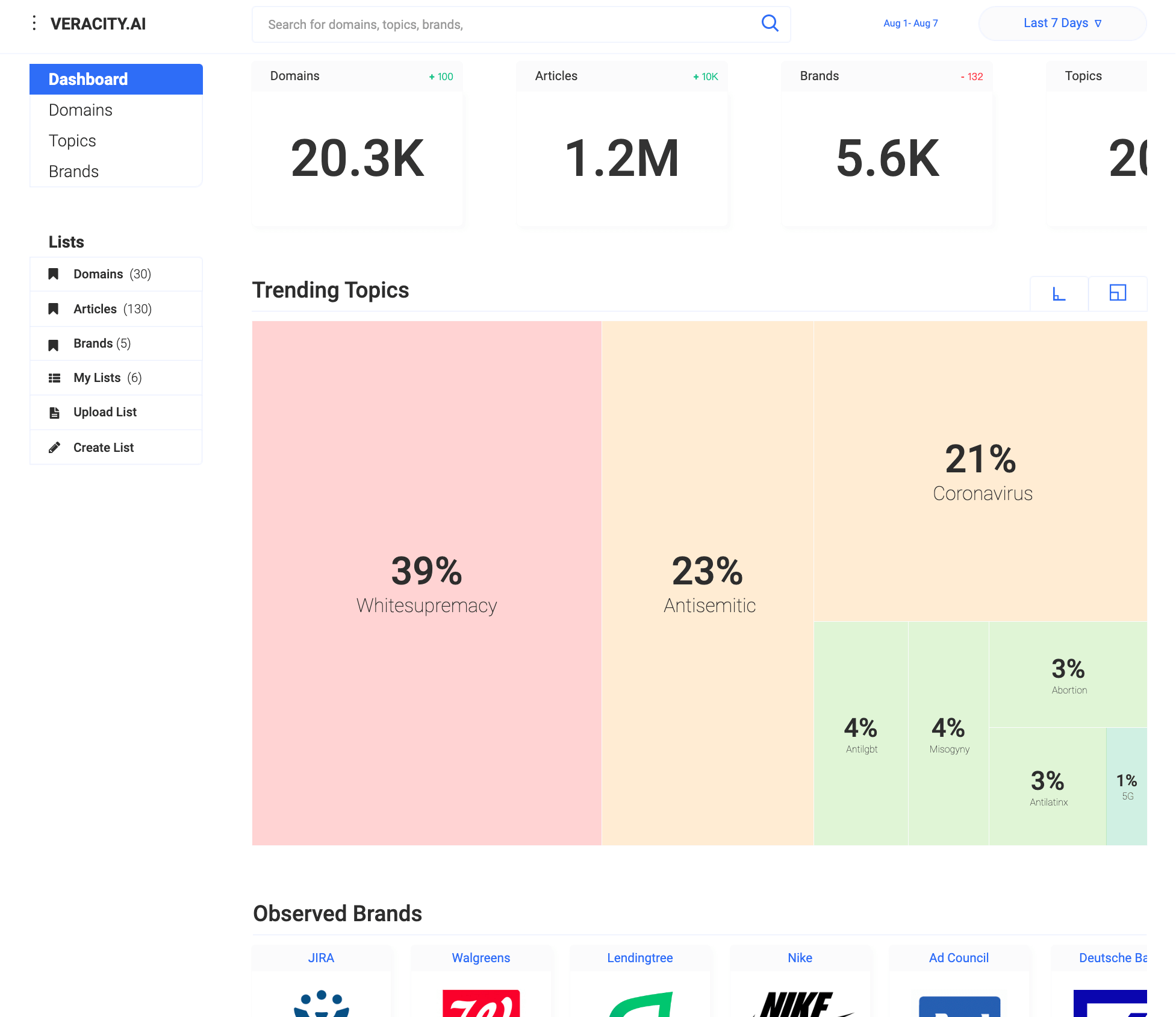
A centralized hub that instantly orients teams with a unified, data‑driven view of project health, milestones, risks, and next steps.
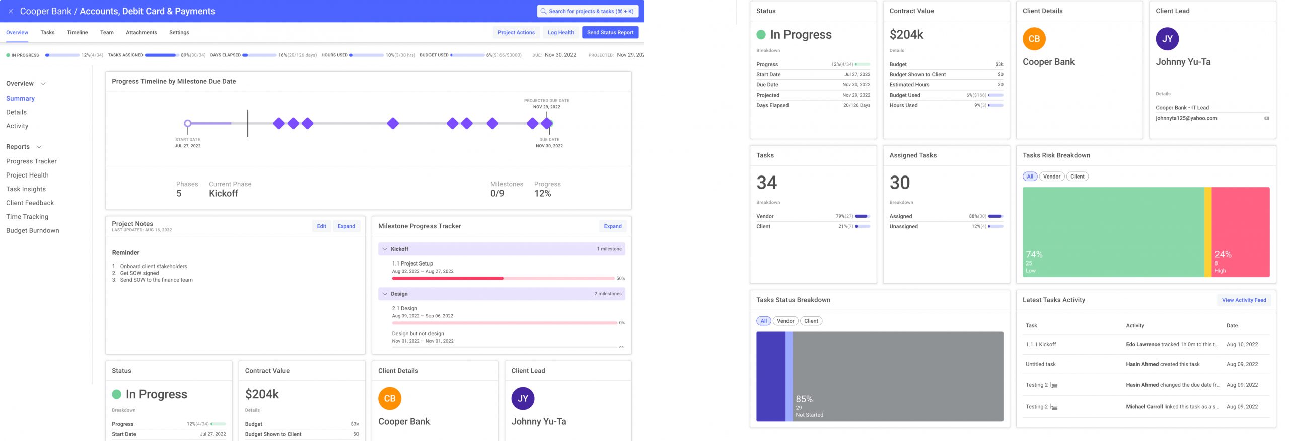
Lead Designer
I led the end‑to‑end design of the Project Overview Hub, partnering with product and engineering to turn research, user stories, and competitive insights into a cohesive, intuitive experience. The FRD informed the information architecture, interaction patterns, and system logic across milestones, contacts, and activity feeds.
Identified KPI
Reducing onboarding and context‑switching time by enabling clients and vendors to understand project status, ownership, and upcoming actions within seconds of entering a project.
Advanced Prototyping
Developed interactive prototypes that integrated milestone tracking, risk signals, and a unified activity stream—turning static status reports into a dynamic, continuously updating project hub.
A multi‑year study revealing how educators, families, and practitioners search for child‑development measures—and how to convert that intent into stronger campaigns and clearer user pathways.Lead Analyst & Strategist
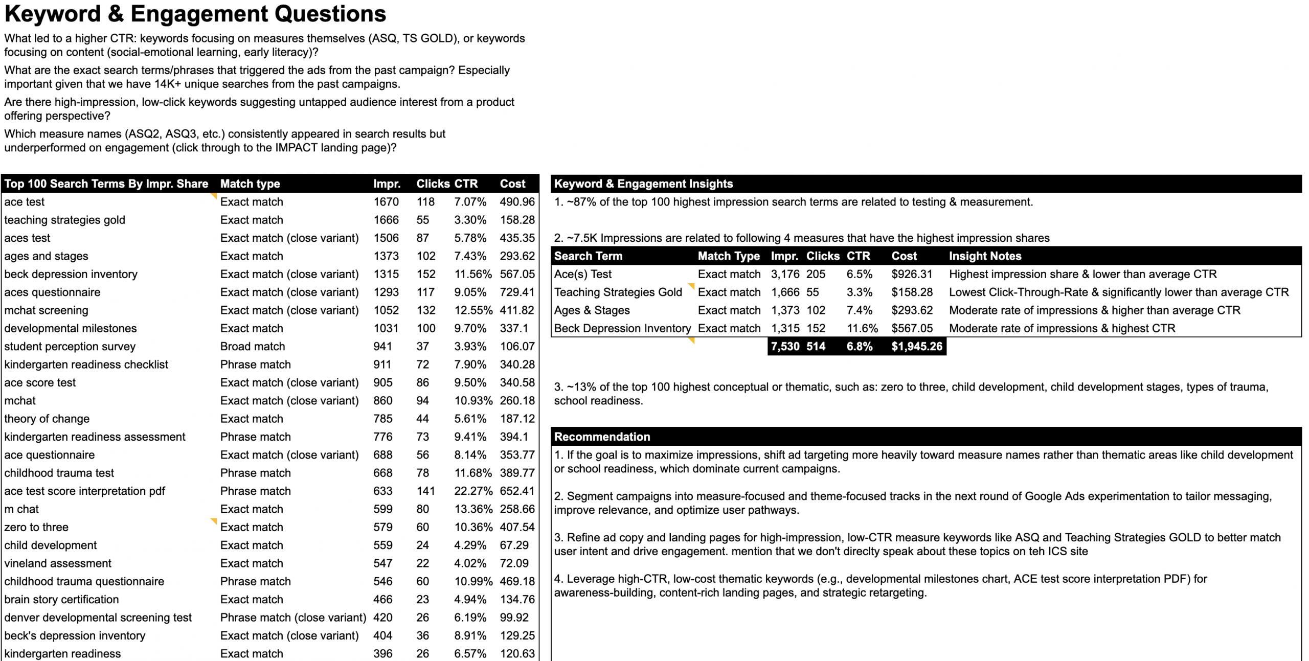
Lead Analyst & Strategist
I analyzed ICS’s Google Ads and on‑site behavior data, reviewing 340K+ impressions, 31K clicks, and multi‑step navigation flows to understand which keywords drive intent, where users drop off, and how visitors move toward the IMPACT Measures Tool.
Identified KPI
Increasing high‑intent traffic to the IMPACT Measures Tool by pinpointing the measure‑based and thematic keywords that most effectively convert.
Advanced Analysis
Mapped the top 100 search terms, segmented measure vs. thematic intent, evaluated seasonality trends, and analyzed user pathways from homepage to IMPACT, Resources, and Research & Evaluation content. The work surfaced major drop‑offs, high‑CTR opportunities, and structural navigation issues that informed recommendations for campaign strategy and site UX.
A structured research initiative designed to understand how site‑level users across 149 active sites experience DAISY and what improvements will most enhance their daily workflows.
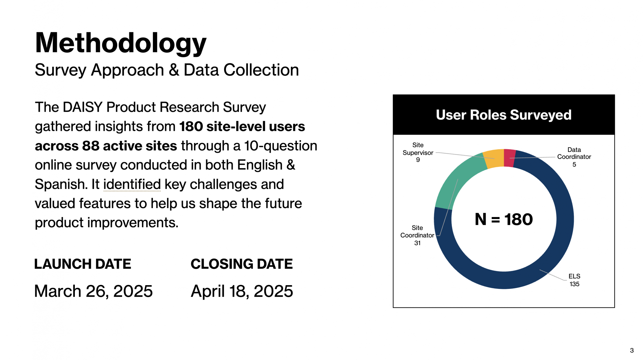
Lead Research & Survey Designer
I planned and executed a 15‑question, bilingual survey targeting key site‑level roles to surface user needs, challenges, and feature priorities. The work included defining objectives, identifying audiences, drafting the questionnaire, and coordinating a four‑week rollout to ensure broad participation.
Identified KPI
Improving product alignment with real site‑level workflows by identifying which features users rely on most, where friction occurs, and what enhancements would meaningfully improve program management.
Research Approach
Designed a role‑specific survey covering usage patterns, pain points, feature satisfaction, and desired improvements across Scheduler, Site Program Management, Reports, and User Management. Insights will guide 2025 product development, user training, and strategic decisions.